
CSCI 462 Software Engineering Capstone Project: Mercedes-Benz Vans Plant Visualization Tool
Using Agile software development methodology, our team of 3 developed a web application for Mercedes-Benz Vans (MBV) that could function as an add-on to Nagios Core, an open source IT monitoring tool already in use by MBV. Our contacts at MBV pitched this project idea at the beginning of the semester, claiming that they really like how useful Nagios is as a tool, but it lacks visualization of where devices are located on the factory floor. Our job was to incorporate KML files into the app and visually show the location of devices that were in critical condition so that production managers can quickly recognize when devices are down on the line.
My two amazing team members for this project were Vincent Nguyen and Michael Henry Johnson (both Class of 2017).
Final Presentation Video:
As a team, we had to sign a non-disclosure agreement so I cannot talk too much about the actual code. We created a video which was played on final presentation night April 2017 and presented our project to an audience of about 100 people. Unfortunately, we are no longer able to publicly host the video due to security concerns from the MBV team.
Technologies used for this project:


Brief Dashboard Explanation:
Here is what the Dashboard looks like when it is running. Statuses of devices, stations, and areas are reflected by the colors green, yellow, and red - like a traffic light. As you can see, it is embedded into the Nagios Core software (you can see the Nagios sidebar on the side). You go over to the sidebar, click on the "Dashboard" link, and the map loads.
We used the Google Maps API to display the map and KML files to define the building and area polygons. On the right is a collapsible menu where the stations for each area are displayed along with devices corresponding to each station. Once a device is in critical condition (red), the area will be displayed as red on the map until that device is fixed and up and running again, allowing for smooth running of the factory floor.
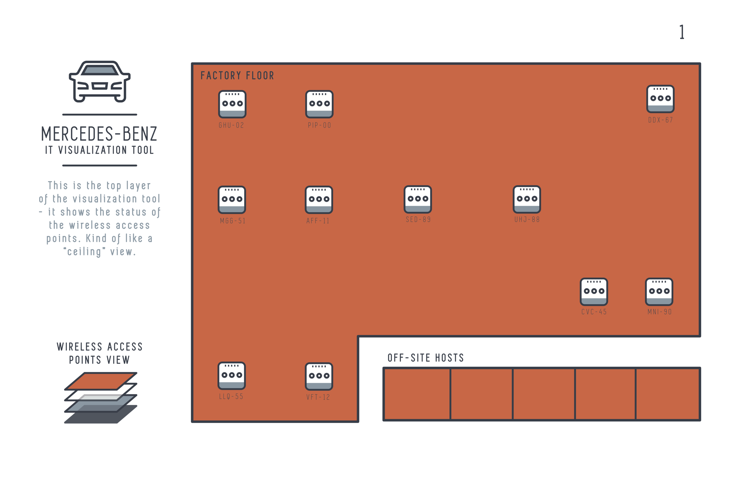
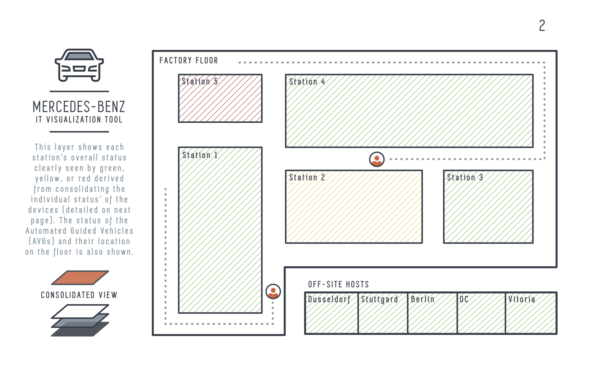
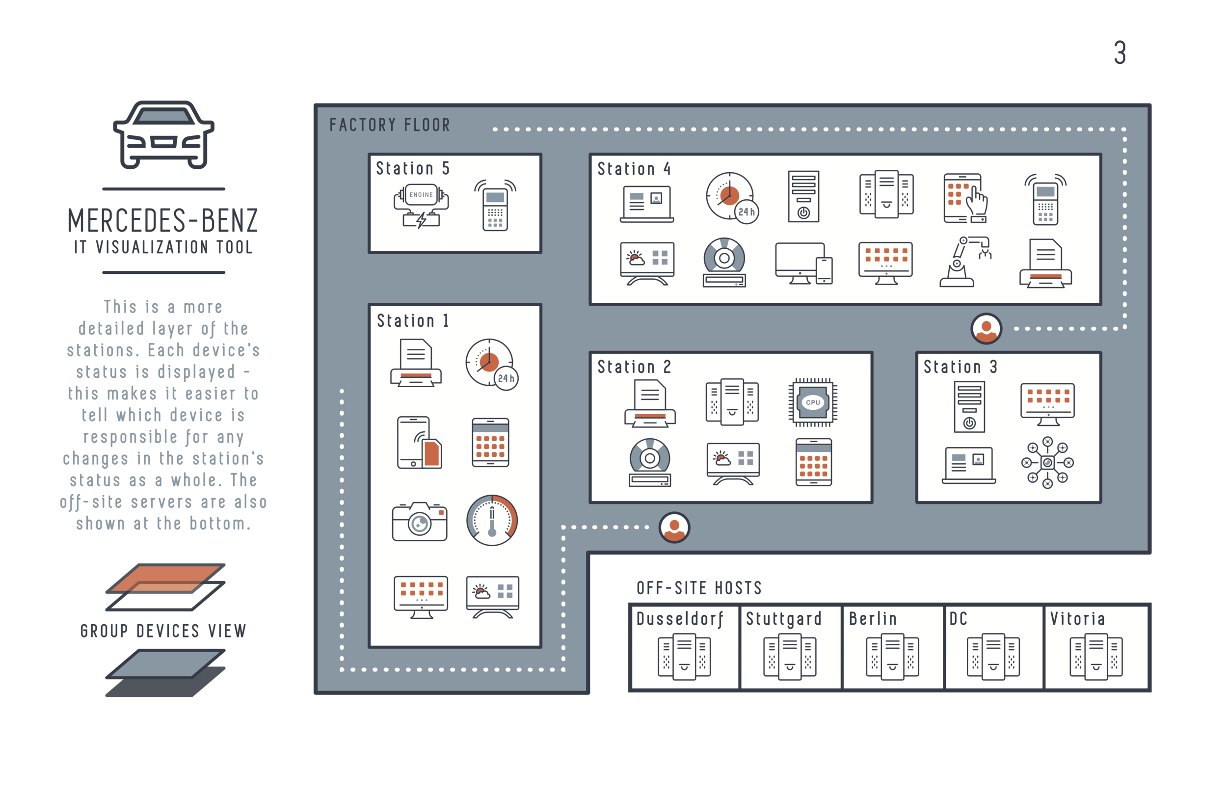
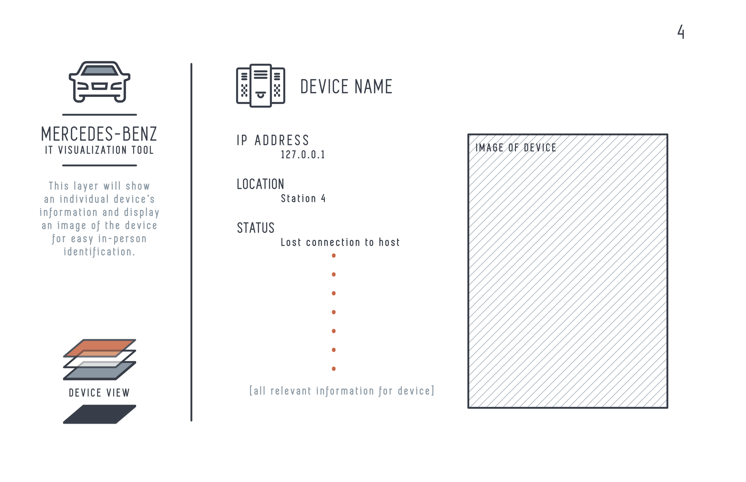
Original Design for the Dashboard:
Before we knew that we would be using Google Maps and KML files, we came up with this design for the Dashboard application. We planned on using layers to display the consolidated areas of devices and then icons to display each device on the station.
How we set up our Docker Container (running Nagios), our Vagrant VM (running Docker), and our Synced Directories...
Right at the beginning of the project, we had difficulty running Nagios, which needs to be run on a Linux system. Also, running Ubuntu in Virtual Box is incredibly slow sometimes. Our project's success can be attributed to our workflow set up (shown below). The team had members who used both Mac OSX and Windows. Using a Vagrant VM, we were able to run a Docker container that ran Nagios. We synced code source files across this inceptional set up and then linked our native desktop file to our Github repository to enable pushing and pulling of the shared code source. This set up made sure that we were not dependent on any one platform and could program natively, allowing for a much faster workflow.
